The most valuable piece of feedback I received was that I needed to think about the emotions of my pieces more and that I need to focus on perspective. Secondly, I was praised for the range of media I used and my presentation, which I will continue to uphold and develop in semester 2. The most valuable thing I learned from a peer was his particular style in use of limited colour. In my work from week 11 using only two colours, I did simply that and drew in black and white; this student decided to use colour only in certain parts of his pieces and grey for the rest, the results were stunning. I hope to implement this technique in future pieces.

(1)
Feedback from peers regarding work from week 11 and 12 of semester 1.

(2)
Grading criteria for the group; created in class.
After this exercise, we were introduced to the concept of 'tableaux', defined as "a picturesque grouping of persons or objects; a striking scene" (dictionary.com, 2017). We split the group in half and created and acted out freeze frames for the other group to draw.
Firstly, I drew some thumbnail sketches based on the prompts given by our tutor (see figure 3). This got me inspired and got ideas going in my head, then with our ideas combined, the group and I came up with the idea of "Gossip" as a theme and acted it out. I found this exercise really fun and different.
Acting out a scene gave me a new respect for life models; after a few minutes it was difficult to keep still and time seemed to go slowly, it also felt strange to be watched. I think it was an important exercise in understanding the whole process of life drawing.

(3)
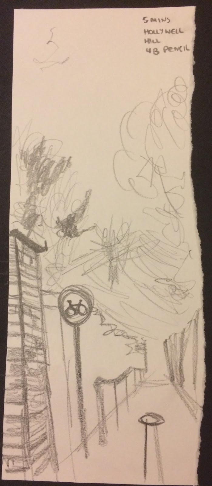
Thumbnail Sketches
Byro
After acting out our scene, it was time to draw the other group. I really enjoyed this exercise. I had a great view regarding the use of foreshadowing and the scene had such life in it. It was also fun to draw people of different heights, shapes and genders in different positions in relation to each other.
In the first 10 minutes (see figure 4), I focused on shapes and outlines, getting the basics of each character in the scene. In the 10 minutes after that (see figure 5), I focused on shadow to add depth. Upon feedback, in the last two minutes, I tried to add detail to the gentlemen on the far right and the lady far left in the chair. This would be to accentuate the foreshortening and make for a more interesting image. In hindsight, I wish I had realised this earlier as it would have made for more of a finished piece.
I like the piece I've created but I found the proportions of the people difficult, e.g. the arms on the second figure from the right were originally too long and I could not rub the charcoal out. I also needed to focus on the environment more as they look slightly like they are floating, despite their shadows, especially the gentlemen far right who, was in fact, sat on a table.

(4)
"Birthday"
Tableaux Stage One
10 minutes
Charcoal

(5)
"Birthday"
Tableaux Stage Two
10 minutes
Charcoal
Upon reflection, I plan to focus specifically on these points for improvement:
- Proportion
- Clarity in my images
- Responding to the brief with originality
- Having emotion in my pieces
And carry these good habits forward:
- Organisation
- Time management
- Use of media
- Development and experimentation
- Regular extra-curricular practice
References:
Dictionary.com. (2017). the definition of tableau. [online] Available at: http://www.dictionary.com/browse/tableau [Accessed 31 Jan. 2017].