Saturday 25 February 2017

Semester 2. Week 4. Independent Study. Experimental Picture Making

After the lesson, I had an idea in my mind of what I wanted to create. I was really pleased with my accidental birch tree background in my last piece so I wanted to recreate that as a backdrop.

I began by attempting that, using black acrylic on white A1 paper with a small roller. On my first attempt it didn't go perfectly, but by the third try; I had a good backdrop and some textured paper to use for collage.

I usually time each drawing I make but in this case, I was working on both pieces and their counterparts as the other was drying. The entire process took roughly 3 and a half hours to complete.

I am really happy with the results although I should have created more tone in figure 5. However, I do like this piece as it contrasts with figure 6. I am really happy with figure 6; I think the piece has a magical/ fairy tale mood and conveys a narrative, fitting well with the brief. I wanted to play with scale in one piece, and spend a lot of time creating a magical mood with the other and I feel I achieved that.

(1) 
Experimenting
Black Acrylic on White Paper

Here, I wished I had a variety of rollers to create the effect of variation in size with the trees, however, I used what I had and I still think it turned out well.

(2) 
Experimenting
Black Acrylic on White Paper 

Here, you can see two of my textured pieces. The left was what I used in figure 6. I used black acrylic, then white using the roller. The left was a horizontal and vertical straight movement, used as the backdrop in figure 5. I am happy with how both came out.


 (3) 
Experimenting with white on black &
White Acrylic on Black Paper
&
Drawing life model, reference from previous drawings.
Charcoal on White Paper

I did not like the effect of white acrylic on black paper. It did not have the same impact and so I used the black paper as part of the hedgehog in figure 6. The figures are drawn with reference to the previous week's drawings of the life model. I edited the poses slightly to suit my pieces.


(4) 
Positioning life model to see where I wanted her, which one I wanted to use.


 (5)
Final Piece 1
Acrylic Paint, Charcoal, Chalk

(6)
Final Piece 2
Acrylic Paint, Charcoal, Chalk

Thursday 23 February 2017

Semester 2. Week 4. Life Model, Animals, Birds...

I thought last week was a great lesson, but this week was even better. I like to draw animals in my own time so this task was fun for me. I also enjoyed the Worcester Museum and Art Gallery study we did last semester, so was interested in drawing artefacts from their collection yet again. 

Much like the previous lesson, we got to play with composition a little more again, giving more me more freedom to create an interesting composition. Experimenting with scale and position was great in the sense that it created a narrative within the images, particularly with figures (7) and (8). 

I learned a lot in this session, about composition and about, when doing a slow drawing, to concentrate on the line and not always use a scribbly style. I definitely need reminding to do this as I have to admit, I hide behind this style when I find a drawing hard. Though when I did slow down, seen in figure (6), I created a really nice piece. This boosted my confidence and will think back to this in future when I feel overwhelmed by a scene I am drawing.

A difference in my practice this week was that instead of using an easle, I sat with a board on my lap. In some ways, this was an advantage in that I could sit close to the life model and taxedermy. However, it had a negative impact in the way that some of the tableaux in front of me was obstructed from view sometimes, such as the life model's feet. It also made it difficult to draw anywhere but the middle of the page, due to not being able to distribute the weight of the board unevenly on my legs, or be able to draw portrait without completely obscuring mine and everyone behind's view. I'm glad I tried it, but next time I will use an easle. 

(1)
Charcoal on Paper
Left: 5 Min
Right: 2 Min

These are very scribbly images just getting the shape of the animals. I am pleased with them and they were a good warm up.

(2)
Charcoal on Paper
10 Min
I am pleased with the owl in this piece, I think it shows character. The life model, however, looks a bit odd. I think I made have misinterpreted the tone as the shading on her face doesn't look right or create a 3D effect.

(3)
Charcoal on Paper
5 Min

This piece is ok, this was an exercise in shape and I believe I achieved the general shapes in the tableaux, although the life model's legs look not quite right.

(4)
Charcoal on Paper
5 Min

This piece was ok tone wise, but the face is odd and her legs could have been drawn better. I don't hate this piece, but I definitely need to work on my proportion in quick drawing.

(6)
Black Byro Pen on Paper
15 Min

This piece was pivotal to my learning. I started the image on the right, using a scribbly style, but then as I was drawing my tutor gave me feedback to slow down and concentrate on making precise lines. I dreaded this, as I thought I would create a bad drawing by slowing down. As I mentioned in my introduction, scribble-style is a comfort zone and so I was reluctant to leave it.

However, the minute I did the piece started looking better. I have never drawn like this and will definitely be using the technique again, it looks 3D and has it's own style - even if the animals look funny, it's in a stylised fashion, and i've very pleased with my depiction of the life model.

(7)
Textured/ Prepared Paper Collage, Black and Brown Fine Liner & Chalk on Paper
37 Min

I found using collage and textured paper, and embracing the chaos of cutting and sticking on the fly, immensely fun. I had to think on my feet as collage is usually something you sit and think over, move pieces around and take pictures with, but here we had to speed up. I ripped some bits, cut some, and found enjoyment in the different style that came through. I also enjoyed playing with scale and composition here, making the animals large and close to the life model, out of their glass cages.

(8)
Charcoal, Black Fine Liner & Chalk on Textured/ Prepared Paper
13 Min

Aside from my continuous line drawing (Figure 6), this piece is my favourite. I chose this textured background over the others I had prepared because it reminded me of birch trees - which are incidentally my favourite kind, I love to draw them. Because I chose to use an A3 piece of it, I had less space for detail; I concentrated on the life model and one animal. I think it turned into a really illustrative and storybook-like piece. This defintitely creates a narrative in ones mind; why is this bird caged in the forest? Who is that woman? And as a joint honours student with Creative Writing, I loved that element.

Monday 20 February 2017

Semester 2. Week 3. Independent Drawing Task, Spooky.

I decided that for this task, I would take a mundane setting, and using the medium of charcoal create a spooky mood. I chose the street I live on, and inside my house. I feel like the pieces are successful and that the way I drew each one gave the desired effect. 

I am really starting to enjoy using chalk with charcoal as I've found with some of the charcoal I use, it is difficult to create white marks on top with an eraser alone.


(1)
Charcoal, Chalk & Tissue
15 min

This first drawing is of the kitchen door in my house. The hallway is dark and the light is seeping through the door. I think it creates a narrative of, "what's behind the door?" and has a good light/ dark contrast. 

(2)
Charcoal, Chalk & Tissue
20 min

This was the street outside my house. I love the street lights and how they light up the areas surrounding them. I do think, however, that I have skewed the pavements somewhat. I have made it curvy, which it is not.

(3)
Charcoal, Chalk & Tissue
20 min

This is my favourite piece as I feel it fits the brief most. It is a drawing of my front door. It has an ominous feel to it, much like figure 1, in the sense that it makes the viewer think, "what's behind the door?" Also, it was unintentional, but the door fades to black as it reaches the floor, adding to the spooky vibe.

(4)
Charcoal, Chalk & Tissue
15 min

Lastly, I have another image of the street. I think I showed the light very well here but maybe not proportion. I find cars difficult to draw in general, let alone from the angle I chose. It also doesn't look as spooky as the other pieces, so is my least favourite. 

Thursday 16 February 2017

Semester 2. Week 3. Class. Skeletons, Anatomy and the Gothic.

This lesson was the most interesting life drawing lesson so far. I really enjoyed figuring out composition between two forms; flesh and skeleton, and learning new techniques like drawing with a candle

I enjoyed the freedom of adding mood to my pieces (figures 6 and 7 were particularly successful in my opinion) and find myself beginning to see the benefits of charcoal, a medium I have not enjoyed in the past due to the mediums predisposition to smudge and make a mess. 

(1)
Candle, Diluted Ink, Tissue Paper
Within 20 min warm up

(2)
Candle, Diluted Ink, Tissue Paper
Within 20 min warmup

Figure 1 and 2 illustrate the warm up exercises we did with a candle and some diluted ink. I found this an interesting exercise and good for getting out of my self-critical mindset. I tried drawing with both the wax and the ink itself, of which I found the ink nice to draw with for the full figure, and the wax good for the head. It is a technique I would like to explore more, possibly using different inks and coloured paper backgrounds.

(3)
2B Graphite Stick
25 Mins

I received feedback during the execution of this piece (figure 3), that I had not used a good composition. Because of this, I added people in the background to make it better but I could have made it more interesting from the get-go with some planning and a view-finder. I tend to take things literally and so did not realise I could create my own composition, this is why I chose to include the entirety of both figures. In future, I need to be less worried about making mistakes and go with my gut. Saying all that, I like the piece. I think I've done well proportionally, though I may have made the life models neck too long. I didn't necessarily like using the graphite stick as I couldn't make really dark marks, though the point of this exercise was creating the correct shape, I dislike the lack of tone.

(4)
Charcoal 
25 Mins

I found this composition difficult because the life model and the skeleton were sat fairly far apart. I felt that focusing on the bones made me focus less on the flesh because there was more to draw, and so I created a less tonal depiction of the life model, making her less 3D. I find the composition fairly boring and don't feel it is an entirely successful piece. 

(5)
Charcoal
25 Mins

I decided to do my own composition and go outside of the box, after feedback from my previous pieces and looking at what my peers had done. I like this much more than my previous pieces because it's interesting. The only criticism I have is that, again, I have used less tone on the life model because I am concentrating on getting the bones correct. Nonetheless, I really like this piece.

(6)
Charcoal, Chalk and Eraser
30 Mins

I loved doing this piece. I found it difficult to draw at first but once I'd got my proportions sketched in, it was just adding tone. I experimented and rubbed out a white circle where the light source was on the life model to keep me on track, which worked really well. It also gives the piece a fantasy tone as it looks like a moon. I only wish I'd made the shadow underneath the figures darker.

(7)
Charcoal, Chalk and Eraser
30 Mins

Here I feel like I got the tone right, but I don't like the face I've done on the life model. I used the technique of marking my light source again and it really helped. Also, I smudged the charcoal used for shadow which made for darker lines, improving on my mistake prior. I am really pleased with this piece and feel it is one of my best life drawings so far this year.

Monday 13 February 2017

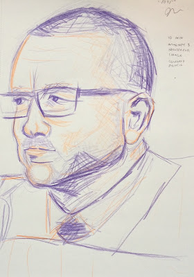
Semester 2. Week 2. Independent Study, Portraits

This independent study task, I found, was the most challenging yet. With a still photograph to work against, I found myself being more self-critical than I would in a life drawing class - seeing every mistake. I also found it hard to go outside of my comfort zone technique-wise, using less soft lines and more gestural marks. I found myself slipping back into my own style rather than embracing that of Elizabeth Peyton, but in doing some drawings multiple times - I feel I did get something from the exercise. 

For some of the images I chose the same photo to recreate, but for others I experimented with different images so that I could try different lighting. My favourites are figure 4 and figure 8, simply because I feel they most successfully illustrate the technique I was trying to emulate. In future I need to learn to let go of self-depreciating thoughts as I draw so that I can 'let go' more and create more quick and emotional marks with media and create a new effect.

(1)
Newspaper Image Attempt 1
Anthony Hampton
Coloured Pencil
10 Min

(2)
Newspaper Image Attempt 2
Anthony Hampton
Coloured Pencil
10 Min

(3)
Newspaper Image Attempt 3
Anthony Hampton
Coloured Pencil
10 Min

Drawing from a newspaper image was particularly difficult. All I had to hand, which is a reminder for myself to be more prepared, was a newspaper and it only had small images of people in it. When I finally found a candid image I found it hard to replicate. I tried a few colours, more harsh lines, hashing - different mark making techniques, but in the end, I found attempt 2 (figure 2) to be the most successful in creating an image with life.

(4)
Friend Attempt 1
Boyfriend
Charcoal
20 Min

(5)
Friend Attempt 2
Boyfriend
Charcoal
20 Min

(6)
Friend Attempt 3
Mother
Charcoal
20 Mins

Although I found each attempt at the 'photograph of a friend' task useful, I actually prefer attempt 1 (figure 4). This is because I chose a photo where the light was easily identifiable and I think it shows in the image. Attempt 2 was good for practising mark making techniques but there is less life in it, and I am not happy with attempt 3 - it's not awful but I'm not proud of it.

(7)
Favourite Musician Attempt 1
Dolly Parton
Pencil 2B - 6B
30 Mins

I found this image the most fun to recreate. With more time than in the previous drawings, I could relax a little bit and take more care with the piece, looking at the image and changing bits when I saw they were wrong. I used sweeping, swirling movements for her iconic hair, and more curved harsh and fine lines on her face to show shadow. I feel I could have made my marks more free in this piece, but I like it as it is.

(8)
Historical Figure
Malcolm X
Charcoal
45 Mins

Although I am pleased with the mark making on this drawing and happy with the life that comes from it, I'm so disappointed that I got the proportions wrong in some areas. The forehead is too big, the eye too small, and I had to reposition the neck towards the end of my drawing. I did however, learn from this piece because of that. I drew it sat down with my pad on my lap, and I should have had it at more of an angle so that I could see the proportions better - in future I will endeavour not to make that mistake. 


References for images copied that I did not take myself:

Figure 1, 2 and 3 -

Griffiths, D. (2017). Worcester City club chairman Anthony Hampton (left) watches on at Bromsgrove's Victoria Ground. [Photograph]. Burrow's Worcester Journal Newspaper.

Figure 7 -

Photo of Dolly Parton found on website:
Sakamoto, K. (2015) 20 beautiful portrait photos of Dolly Parton in the 1970s. Available at: http://www.vintag.es/2015/03/20-beautiful-portraits-of-dolly-parton.html (Accessed: 12 February 2017).
Figure 8 -

Photo of Malcolm X found on website:

Photographs (2015) Available at: http://malcolmx.com/photographs/ (Accessed: 13 February 2017).

Monday 6 February 2017

Semester 2. Week 2. Class. Face and Hands.

Today we focused on close ups of the life models face and hands. I felt like this was a valuable exercise in using what we've learned about proportion and tone on a smaller scale. It also confronted my fear of drawing hands, which I admittedly leave out often in full figure drawings.

One aspect of today's lesson that hindered my drawing process in time and accuracy was my view-finder. For starters, I forgot to make one and so quickly made one when I got to class. This resulted in an inadequate and wrong-sized view, meaning I had to fold it and make do during tasks or using my fingers instead. I will be making a new one for next lesson. 

Generally, I very much enjoyed this lesson. I love drawing faces and I needed to practice and build my confidence regarding hand drawing so it was a great balance of challenging and fun. I tried to focus on proportion in this lesson as in feedback last week, that was pinpointed as my downfall. I feel I was quite successful in proportion this lesson as I was aware of this and made sure to double check size and angles with my charcoal pencil.

Lastly, I found the new technique of using different kinds of marks to make tone very helpful and will be implementing it in future classes.

(1)
Warm up 1
20 sec - 1 min
Charcoal

(2)
Warm up 2.
Top Two: Quick Draw, 2 min 
Middle Right: Non-Dominant hand, 5 min
Middle Left: Continuous Line, 5 min
Bottom Two: Blind Draw, 2 min
Charcoal

I found these warm ups good because they got me into the practice of observing and getting a shape ready for more detail. I always enjoy the challenge of drawing with my left hand, blind or using a continuous line because it tends to come out in a new style. My favourite image is in figure (2). This is because I have captured emotion in the face, and it looks like an old style Disney character! I was pleased to have done this in two minutes.

(3)
Left: Drawing like a landscape, 10 min
Right: Drawing like a landscape,10 min
Charcoal

I found this drawing terribly difficult. My first attempt, pictured left, looks a bit ridiculous in my opinion. It's out of proportion, the nose isn't where it should be, and I think you can tell that I panicked while drawing it. I should have stood back and seen what I was doing but instead, I kept drawing.
The second drawing, pictured right, is much better with regards to feature placement and proportion but still has something wrong with it. I don't like either piece very much, I hope that next lesson, armed with a better view-finder, I can improve on close up images.

(4)
Left: Silhouette, 10 min
Right: Negative Space, 10 min
Charcoal

I really enjoyed this task and feel like I did well. The proportions on both pieces are accurate and they have a peaceful quality to them, particularly the left image. This pleases me as one criticism I received, that I wanted to improve this semester, involved creating more 'mood' or 'feeling' in my images, and I feel like I have achieved that here along with my goal of accurate proportions.

(5) 
Left: 1cm strokes, 10 min
Right: Different line patterns, 10 min
Charcoal

My first attempt, pictured left, i found it hard using 1cm strokes to create tone. The piece isn't bad and I'm pleased with the accurate proportion I have achieved but it doesn't look finished. When I then practiced different mark making with the second attempt, pictured right, I had gotten used to it and so created a more finished piece. With this attempt, the eyes are far too big and the facial features look exaggerated. Although I like this stylised look; I would have preferred accurate proportion as that is my goal. 

(6) 
Left: Focus on Proportion, 10 min
Right: Focus Different line patterns, 10 min
Charcoal

Honestly, I dread drawing hands. When I can take my time, I can enjoy the process - but 10 minutes to accurately depicted the life models hands had me in a panic. My first attempt, pictured left, the fingers are wonky and the whole image looks unfinished - I'm sure this is down to a lack of confidence as my second image, picture right, is so much better.
I really like what I have drawn here as it shows good proportion, tone, and a variety of mark making techniques. I do however, in hindsight, wish I had used more middleground tones to create more of a 3D effect.

(7)
Left: Focus on Hand Detail, 10 min
Right: All we've learned, 25 min
Charcoal

Thirdly, pictured left, is the drawing I did focused on hand detail. Proportionally I am pleased with it, but I wish I had more time to draw this image as it looks unfinished. I should have moved my viewfinder closer so that I drew a bigger hand, filling more of my page; this way I would spend a similar amount of time focusing on detail, but it would look more finished.
Lastly, pictured right, is my last image of the day. I was very pleased with this drawing. This is because I feel it encompasses everything I had learned that day about tone, proportion and mark making. I have used a good range of tone and marks and created a 3D image, incorporating the background and the hands.

Sunday 5 February 2017

Semester 2. Week 1. Practicing Tableaux, Painting.

I decided to paint the stair scene in gouache as many of the famous tableaux pieces, e.g. The Last Supper by Leonardo da Vinci or American Gothic by Grant Wood, were illustrated using wet media. I chose it over other wet media because after using it for a task during the holidays I wanted to experiment with it more.

I first did a background layer which took me an hour. I sketched everything with a HB pencil, careful to keep track of my proportions - the stairs made that easier as I could measure limbs in steps. I then went over in gouache. After this I added some detail with more gouache. It is by no means a finished painting but a good experiment in the practice of tableaux are and the medium of gouache.

I like the painting as it is simple and I focused on shape, proportion, light and shadow rather than detail. I wanted to get to grips with drawing people in relation to each other and I think I did so successfully. In future I will allot more time to a piece like this as I would have liked to add more detail. I can also see that the ceiling looks strange and the background needs more work.

(1)
Layer One, Stairs Tableaux
1 hour
HB Pencil and Gouache


(2)
Layer Two, Stairs Tableaux
30 mins
Gouache


Friday 3 February 2017

Semester 2. Week 1. Practicing Tableaux, Photographs.

In order to practice the art of tableaux, myself and some classmates got together to take some photographs on campus.We didn't pick a specific theme, but upon reflection, I think it illustrates university life well (bar figure 4, one would hope).

It took about 25 minutes in total to get all of the images done and Carolina sent us the files the same day, so the process was quick. It was good to collaborate with other members of the group and I hope to do so with projects in the future.

My favourite photographs are figure 3 and figure 4. They, in my opinion, have the most life in them. I plan to paint one of these photographs tomorrow or Sunday, which you will see in my next post!

(1)


(2)

(3)

(4)

(5)

(6)

Photo Credit: 
- Karolina Sedilekova

Participation Credit: 
- Karolina Sedilekova
- Kristina Krchmanova
- Carys Pinches
- Nikita Bidwell
- Kayleigh Fletcher

Location:
- St John's Campus, Henwick Grove, Worcester